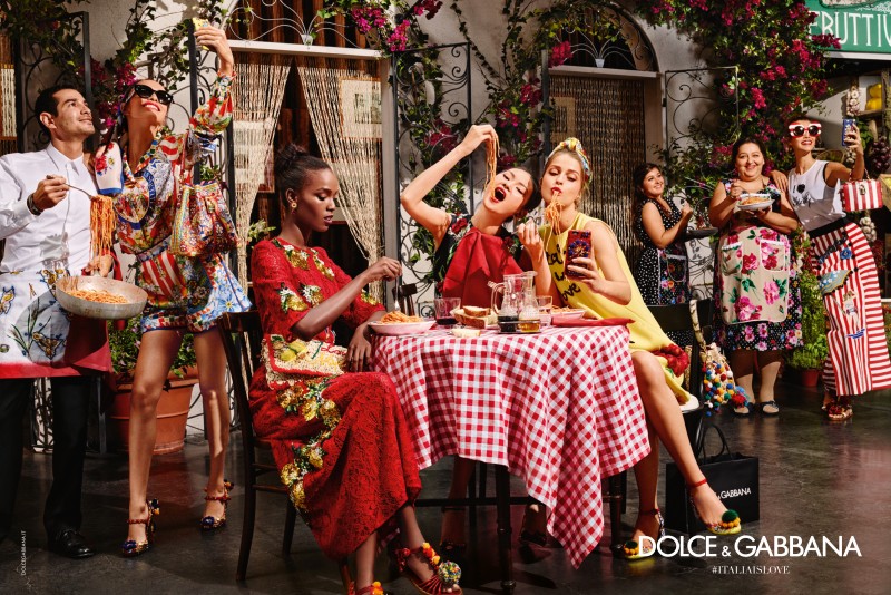
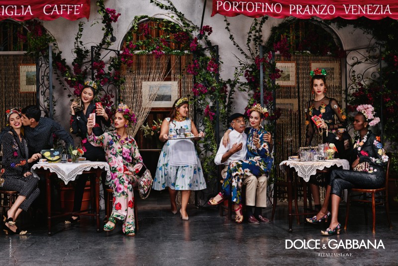
The first message I took in was this traditional Italian village during the summer. The advertisements for this campaign tells the story of the Italian lifestyle through fruit stalls, small shops, spaghetti, coffee, and family. This advertisement conveys fancy, positively, food, history, love and all things associated with Italy.
Through these advertisements, Dolce & Gabbana plays on the intended meaning of creating a sense of family communication by casting various generations to create this colorful and somewhat realistic scene. In the ad, the advertisers depicting this sense of locals and tourist coming together between the ones that know the Italian life and those looking to embrace it. The overall message is that in this Dolce & Gabbana collection you to can feast together, chat, have fun and take selfies all while meeting new people in Italy.
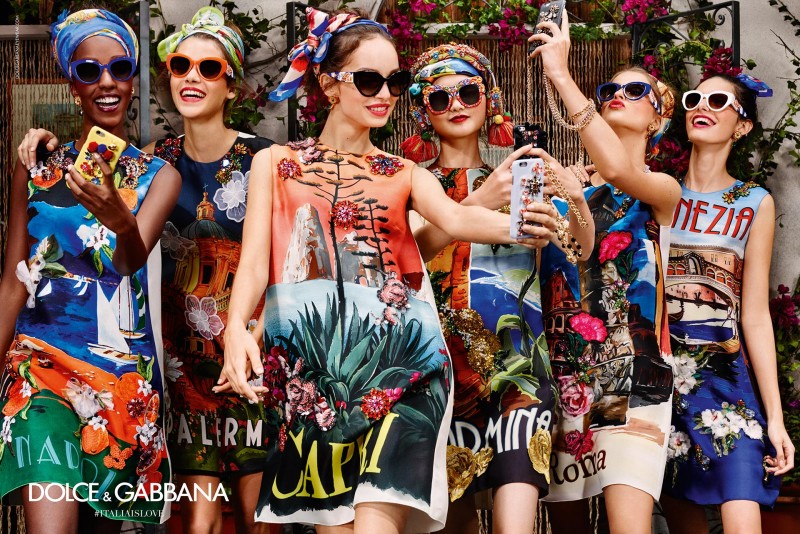
In this 2016 summer campaign, Dolce & Gabbana interprets the concept for its viewer by merging the sense of the past and the contemporary by playing on the traditional Italian culture we know with the modern day addiction to technology or documenting our every move. As you can see, in each advertisement two or more groups are posing with their “friends” to take a selfie, which is a look at the current cultural norms not only in Italy but worldwide. This norm is proven one step further by adding #italiaislove under the brand name to promote the digital world by selling the hashtag.
In these advertisements, they use models’ ranging in age from 15 to even 50, which allows the brand to become appealing to a much wider range. Being in a publication such as Vogue, the target market becomes more elite or the consumer with money who lives this innovative, jet setter lifestyle. The advertisement pulls in its tribe by going back to the ideological meaning of Instagram and selfies is this sort of social media phenomenon.
The selling message for these ads is very apparent just by a glance. The brand is using the sense of travel by allowing the viewer to become a tourist and playing on our senses with the bright colours, our smell with the spaghetti, and coffee shops of Italy. It is taken one step closer by adding in the phones and the concepts of the selfie to draw in the younger generations, which adds a sense of familiarity and reliability. The images are also packed with bright colours, eye-catching patterns, and props that allow the viewer’s eyes to wander through the pages, finding something new to look at.
Why This Ad Is Appealing:
- Bright colours, eye-catching patterns, and props that allow the viewer’s eyes to just wander through the pages.
- The use of location and excessive use of props allows the viewer’s eye to always have something new to see allowing for a longer viewing time.
- Coming out of a long winter, this sense of vacation and warm weather.
- The use of the foreground, middle ground, and background is pleasing to the eyes.
- The story line became addicting. Every month you knew they would be somewhere and doing something new in Italy. This lets the consumer have a sense of anticipation of “what’s next?”